This tutorial is kindly provided by the plugin developer. Please note that some of the VamTam themes come with Layered Slider or VamTam Slider, so make sure you are reading the right guide :)
Setting up the Revolution Slider
We always recommend importing the demo content. If you have done so you would have imported the sample sliders that come with the theme and replicate the one on the demo website. You can use these sliders as a starting point for your own website. The "sample sliders" are well designed and complex sliders. If you are not yet familiar with the slider and theme options it is a must to use them.
Revolution slider is powerful and complex parallax slider. It gives you unlimited opportunities to create slides with many sub layers with different animation.
Please note that the Revolution Slider is a plugin and have its own option panel found in the main left side navigation menu - Revolution Slider
Activating the Slider in Pages/Posts’ Header
Local Settings
You have local slider options that can be found just below the text editor in every page/post.

Troubleshooting
Some of the plugins may interfere with the way slider works. Please deactivate all your plugins, clear your browser cache and see if this fixes the issue.
Inserting Revolution Slider to your page
Inserting the slider using the Drag & Drop Builder
You can place your sliders into pages and posts using the Drag & Drop Builder.
1. Click on the button or drag into the editor in order to insert it.
2. Click on the "edit" icon of the Revolution Slider element and chose a slider from the one you've already created.
3. Save Element
4 Publish

Inserting the slider with the Revolution Slider widget
Revolution Slider supports widgets, so you can place your slider in your front-end page just by a drag n' drop. To do that, navigate to the Appearance menu on your left sidebar and select "Widgets". Grab the Revolution Slider Widget and drop it into one of your widget area.
Ways to add the Slider to your Theme:
- * From the theme html use:
<?php putRevSlider( "alias" ) ?> example: <?php putRevSlider("homeslider") ?>
For show only on homepage use: <?php putRevSlider("homeslider","homepage") ?>
For show on certain pages use: <?php putRevSlider("homeslider","2,10") ?>
- * From the widgets panel drag the "Revolution Slider" widget to the desired sidebar
- * From the post editor insert the shortcode from the sliders table
1. Shortcode Methodback to menu
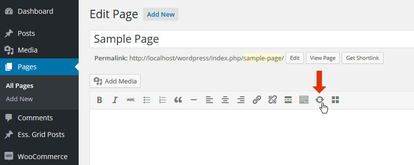
From the slider's main settings page, copy your slider's shortcode to your computer's clipboard.
And then paste the slider's shortcode into your page's main content area.

2. Quick Shortcode Creatorback to menu
From the page's main content editor, select "Revolution Slider" icon.
Then select a slider and choose "Add Selected Slider".

3. Add Slider to Theme's Widget Areaback to menu
From "WP Menu -> Appearance -> Widgets", you'll find "Revolution Slider" listed.

Then drag and drop the "Revolution Slider" box into one of your theme's "Widget Areas".

Widget Options:

1. Optional title to be displayed above the slider
2. Choose the actual Slider you wish to display
3. Choose to only display the slider on your homepage
4. Enter a set of page ID’s to only display the slider on a set of specific pages (page ID’s separated by commas).
4. Visual Composer
If you have the Visual Composer plugin installed, click the "+" button to add a new element.

Next, select "Revolution Slider 5", and you'll then be shown the Quick Shortcode Creator.
Create Slider
1. Create a New Slider
1.1 From the plugin's main admin page, select "Create New Slider".
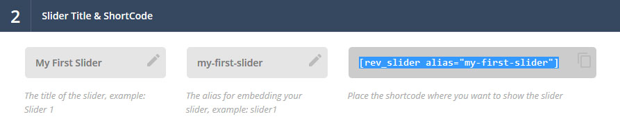
1.2 Enter a Slider Title (1) and Alias (2), and click "Save".
Quick Note:
Before saving, you can select several of the slider's settings from this page. But choosing these settings are not required to officially create a new slider, as they can be adjusted afterward.
Alias Naming:
The slider's "Title" can be anything, but the "Alias" should not have any special characters or spaces (but dashes and underscores are ok).

1.3 You'll now be redirected to the plugin's main admin page where you'll see your new slider listed.
2. Start with a Demo Slider
There are two types of demos that can be imported. The first are those included with the plugin by default, and the second are those that may be included with your purchased theme.
When choosing “Add Slider Template”, you will be shown the “Template Library”, which will include a large array of free templates for you to choose from, and also where the Premium Sliders can be found.
2.1 Add Slider Template
Choose "Add Slider Template", the view the Template Library.
Important Note:
Register your Purchase Code to gain access to the free Premium Sliders.
Category Filters: Narrow your template search to a specific category.
Update Library: Check to see if new templates are available.
New/Updated: View the latest templates.
Scrollbar: Scroll the template list window to view templates below the fold.
Preview Button: View the template’s live demo.
Installed: Signals that the template has already been downloaded.
Not Installed: Signals that the template has yet to be downloaded.
Click the "+" icon to view the template's details and install the template.
Quick Note:
If the template has not been downloaded yet, #5 and #6 would just be replaced with a button titled "Install Slider".
Template Overview: Basic information about the template.
Setup Notes: Important information about using the slider.
Requirements: Information about the minimum plugin version and Add-Ons needed to install the the template.
Installed/Available Version: Information about what current version of the template is installed, and its latest available version.
Re-install Slider: Useful for when templates are updated, and also for cases when template content has been deleted by accident.
Add Slider: Install the template.
Become a "Direct Customer" for Premium Sliders:
"Premium Sliders" are only available to direct customers, and are not available if the plugin was packaged with your theme. But if you'd like access to Premium Slider', visit the link below to learn how you can become a direct customer.
After choosing your template, choose how you wish to import it. “Online” will import the template automatically from the ThemePunch servers, but you can also choose “Local” and import the slider from one of the demo zips included with the plugin’s original source.
For the example below, we’ll continue with the “Local” option.
Quick Note:
"Premium Templates" are only available as "Online" imports.
To complete the “Local” import, from the plugin’s original source folder, you’ll find a folder named “example-zips”. Click the “browse” button (#1), and locate the zip file listed in the green box from your computer (i.e. “exwebproduct.zip”). Then click “Import Template Slider” (#2).
You'll then see the template slider listed in the plugin's main admin page.
2.2 Import Slider
Use this option to import a demo that was possibly included with your purchased theme.
Special Note:
Unless otherwise instructed by your theme author, use the default "Custom Animation" and "Default Styles" selections.
3. Slider Management
1. General Options
a. Embed Slider - View options for how the slider can be added to one of your pages.
b. Export - Create a zip file of your slider that can be imported to a different website.
c. Delete - Delete the slider.
d. Duplicate - Create a copy of the current slider.
e. Preview - View a quick preview of the slider from inside the slider's admin.
2. Slider Settings - Content Source, Layout Options, etc.
3. Create/Edit Slides - Individual slide management.
Important Note about Slider Settings:Depending on your Slider Type, not all settings will be applicable for your slider. For example, the Carousel Settings will only be shown when your "Slider Type" is set to "Carousel", and Navigation Settings will not be shown for a "Hero Scene" slider.When adjusting your slider’s settings, a small preview box will be shown to illustrate each setting. This is particularly useful for settings such as “Appearance”, “Navigation”, etc., as it will give you a quick visual of the specific setting.In the following screenshot, “Shadow Type 1” is illustrated in the hover preview box.Stop slider progress when the user hovers their mouse over the slider.Stop the slider after all slides have looped a set amount of times.Stop the slider at a specific slide.Stop slider progress when use hovers their mouse over the slider.Choose to loop your slider if it has only one slide (“Standard Slider” much be chosen as the Slider Type).Stop Slider out of ViewportStop slider when the page is scrolled and the slider is no longer visible.Only start the slider when its scrolled into view (useful for sliders further down the page).Pause the slider when its scrolled out of view.A percentage of the slider that needs to be inside/outside the viewport before slider starts or pauses.Wait for revapi1.revstart()If you’re a developer who’s using the slider’s API, this option can be used to only start the slider when this API method is explicitly called.Click here to view a code example of how this option can be used.Set the default individual slide settings.For example, let’s say you always want your individual slides to start off with a “Slide to Top” transition. Adjusting the “Transitions” value will set it up so all new slides have have a “Slide to Top” transition by default.Or if you already have individual slides created, you can change the value of “Transitions” and then select its checkbox, and then click the “Overwrite Selected Settings on all Slides” button, and the main transition for all existing slides will be changed to the new default value.The timer line that illustrates the amount of time before the next slide is shown.If active, choose the progress bar’s position (top or bottom of slider), its height in pixels, and also its color and transparency level.Normally the slider will always start with slide #1. But if you’d like your slider to start with a different slide, enter the slide’s number here.Sometimes when your slider first starts, it’s more elegant to have a different transition such as a simple fade at the very beginning. Use this option if you’d like to specify a special, initial transition for the very first slide.When set, the special transition will only be executed on the very first slide once. Then once the slider loops, the original slide will default back to its individual slide transition settings.Next Slide on Focus & Disable Blur/Focus BehaviorBrowser behaviour varies when switching between windows/tabs (JavaScript stops executing, etc.). But these options will often correct slider issues related to switching between tabs and windows.Shadows will be shown beneath the slider. Choose between 6 different styles, or choose “No Shadow” (the default option). And preview the Shadow Type as shown in the Primer section above.Dotted overlays are transparent grid-like graphics that will be placed above the slides, giving the slider a “mesh” type look (4 styles available). Preview the options as shown in the Primer section above.The slider’s main background. Normally if your individual slides have their own background images, the slider’s main background would only be visible when the slider first loads, and before the first slide displays. But setting a background here for the slider itself is particularly useful for when you’re using “Transparent” slides (slides with no background image).Choose a solid color or set an image as the background. Apply some padding to give your slider a border. And set specific background image options such as Background Fit, Background Repeat, and Background Position.The slider's animated preloader graphic.The spinner will be shown when the slider first loads, and also for additional slides if LazyLoad is being used. Choose between 6 different spinner styles, or choose “Off” for no spinner.
Please check this link: https://www.themepunch.com/faq/slider-revolution-responsive-tutorial-5-0/ for creating responsive sliders
Choose to disable the entire slider on mobile devices. If disabled, you can replace the slider with a simple fallback image.Disable Ken Burn on MobileThe Ken Burns effect is an advanced animation that looks great on desktop computers, but for mobile devices, providing a more simple slider can sometimes be a better user-experience. Depending on your preference, toggle the KenBurns effect on and off for mobile with this setting.Choose to hide the entire slider, individual layers, or all layers when the screen size is below a specific pixel width (i.e. 640px, etc.).Hiding layers is useful for when lots of content displays nicely on desktop, but there isn’t really enough real estate (screen space) to fit everything on mobile.“Predefined Layers” are specific layers you’ve designed to “hide” under the pixel width set here for this setting.The default alignment for the slider. Options are “left”, “center” or “right”.Margin Top, Margin BottomAdd some space above or below the slider in relation to other content on the page. Both positive and negative numbers supported.
Navigation
1. Common Options: Visibility & Position
Arrows, Bullets, Tabs and Thumbs all have similar “Visibility” and “Position” options, which will be described here in the “Common Options” section for brevity.
1.1 Visibility
Always Show
Yes = Show navigation element at all times
No = Only show navigation element on mouse hover
Hide Under Width
Disable navigation element below a certain screen width. For example, thumbnails look great on desktop, but are often better hidden on smaller screens.
Hide After on Mobile
The amount of time in milliseconds before the navigation fades out of view after a “tap” occurs on mobile devices.
Hide Over Width
Disable navigation element above a certain screen width.
Practical application of "Hide Under Width" and "Hide Over Width" combined:
Combining these two options is particularly useful for switching between two different navigation types depending on the screen size:
Tabs -> Hide Below Width -> 850px
Bullets -> Hide Over Width -> 850px
RESULT:
Tabs will be shown above 850px screen size (desktop)
Bullets will be shown below 850px screen size (mobile)
1.2 Position
Horizontal Align / Horizontal Offset
Horizontal Align: Align navigation to the left, right or center of the slider.
Horizontal Offset: Apply a left/right margin to the navigation in relation to its horizontal alignment (positive and negative numbers supported).
Vertical Align / Vertical Offset
Vertical Align: Align navigation to the top, bottom or middle of the slider.
Vertical Offset: Apply a top/bottom margin to the navigation in relation to its vertical alignment (positive and negative numbers supported).
Aligned by
Choose whether the navigation elements should align themselves based on the entire slider’s area, or if it should always be confined to the “Layers Grid” (works the same way as the Layer Responsive Behavior option).
navigation-visibility-position
2. Common Options: Custom Navigation Styles
Select #1 to open the custom styles panel.
Then choose the colors and styles you’d like to use for your slider’s navigation (#2)
Then save your favourite set of colors for your selected Navigation Style as a “Preset” (3a), and then reuse your favourite styles for your next slider (3b).
3. Arrows
Enable Arrows / Arrow Style
Choose to enable/disable navigation arrows, and if enabled, choose between 15 different pre-built styles.
RTL Direction
Change direction of Arrow functionality for RTL Support.
Visibility, Left/Right Arrow Position
See Common Navigation Options above.
4. Bullets
Enable Bullets / Bullet Style
Choose to enable/disable navigation arrows, and if enabled, choose between 15 different pre-built styles.
RTL Direction
Change direction of Bullets functionality for RTL Support.
Space / Direction
Set the spacing between the bullets in pixels, and choose if the bullets should be displayed horizontally (bullets displayed side by side) or vertically (bullets placed on top of one another) .
Visibility, Position
See Common Navigation Options above.
5. Tabs / Thumbs
Quick Note:
Tabs and Thumbs share the same exact options, and are combined here in this section for brevity.
RTL Direction
Change direction of tab/thumbnail functionality for RTL support.
Wrapping Container
Wrapper Padding:
Space between edge of slider and edge of thumbs/tabs container.
Span Wrapper:
ON: thumbs/tabs will always be stretched across the full size of the slider.
OFF: thumbs/tabs will be stretched to the slider’s Layers Grid.
Wrapper Color / Opacity
Adjust the color and opacity of the tab/thumbs section. Will only be visible if either “Space” or “Wrapper Padding” exists.
Style, Visible Amount, Space & Direction
Style:
Choose between 7 different pre-built styles.
Visible Amount:
The amount of thumbs or tabs that will be visibly shown. For example, if you have 7 slides, but only want 3 thumbnails to be displayed, technically the thumb strip will still contain 7 items, but only 3 thumbs will be visible at any given time, and the additional thumbs will only be shown on mouse-movement.
Space / Direction
Set the spacing between the tabs/thumbs in pixels, and choose if the they should be displayed horizontally (side by side) or vertically (placed on top of one another)
Width, Height, Min. Width
Set the tab/thumb width and height. The width will act as a “Max Width”, and the “Height” will resize proportionally.
For example, let’s say the slider itself was resized down by 50% for mobile. If the thumb width/height were set to 100×50, the thumb size would also be resized down by 50%, and the new thumb width/height would be 50×25.
However, this is where the “Min Width” value is useful. For example, let’s say the thumb width/height were set to 100×50. If the “Min Width” were also set to “100px”, the thumbnails would never resize down.
Visibility, Position
See Common Navigation Options above.
6. Touch
Touch Enabled
Choose to enable/disable touch navigation for mobile. If enabled, swiping the slider left or right with your finger will change slides back and forth.
Drag Block Vertical
Allow for the page to be scrolled vertically when “touch” is enabled. For example, when “ON” is applied, “swiping” the slider in a vertical direction will also scroll the page itself. But when set to “OFF”, the page itself will not be scrolled when swiping the slider in a vertical direction.
Swipe Threshold, Min. Finger
Threshold
The swipe action sensitivity. A smaller number would mean that only a short “swipe” is needed for the slide to change. A larger number would mean that a more elaborate “swipe” would need to take place for the slide to change.
Min. Finger
The number of fingers needed for a “swipe” action to be registered. “1” finger is usually best, as that’s what most users are used to, but depending on your site you can require that users use two fingers to “swipe”, etc.
Swipe Direction
Horizontal:
Traditional left-to-right touch-swipe navigation.
Vertical:
Useful for when your slide animations are set to “Slide Vertical (Next/Previous)”. In this case, swiping up or down would change the slides.
7. Misc.
Keyboard Navigation
Choose to enable arrow keys to navigate between slides.
Key Direction
Vertical:
Up and down keys will act as “next / previous” controls for the slider.
Horizontal:
Left and right keys will act as “next / previous” controls for the slider.
Mouse Scroll Navigation
On/Off:
Capture mouse-wheel movement to change between slides.
Carousel:
Allow for “infinite MouseWheel scroll” for Carousel-based sliders.
Reverse Mouse Scroll
Reverse the direction that the slides change when the mouse-wheel is used.


