


This theme requires Elementor Pro. If you don't have Elementor Pro, please download it here.
If you have any trouble importing the demo content or setting up the theme, we’ll be happy to help. Please open a support ticket at support.vamtam.com.
- The screenshots are for demo purposes and may not be from your purchased theme.

Thank you for purchasing our theme. Before you start, check out this setup guide and the relevant "How to Guides" documentation. We outline all kinds of good information and provide the details you need to use the theme.
Suppose you are unable to find your answer here in our documentation. In that case, we encourage you to search our Knowledgebase, watch the beginners' Video Tutorials, and also perform a search for your answer. Chances are your question or issue has already been brought up, and the answer is waiting to be found. If you cannot find it anywhere, please check out the guide "How to get theme support". Thank you! We hope you enjoy using the theme!
Using a VamTam theme released before InsuraCore? Follow the classic Setup Guide instead.
1. Introduction
InsuraCore and all newer VamTam themes are built with Elementor V4, also called the Atomic Editor. V4 uses new building blocks (Atomic Elements) and a design system made of Variables and Classes. Where it makes sense, the themes also use a few classic Elementor widgets, so you’ll work with both types in the editor.
Requirements:
- WordPress 6 or higher
- Elementor and Elementor Pro, version 4 or higher. Elementor Pro is required for the theme’s Components.
- Atomic features must stay on. They’re on by default in new Elementor installations. Don’t switch them off in Elementor > Editor > Settings > Atomic Editor, or the theme’s V4 elements won’t work as expected.
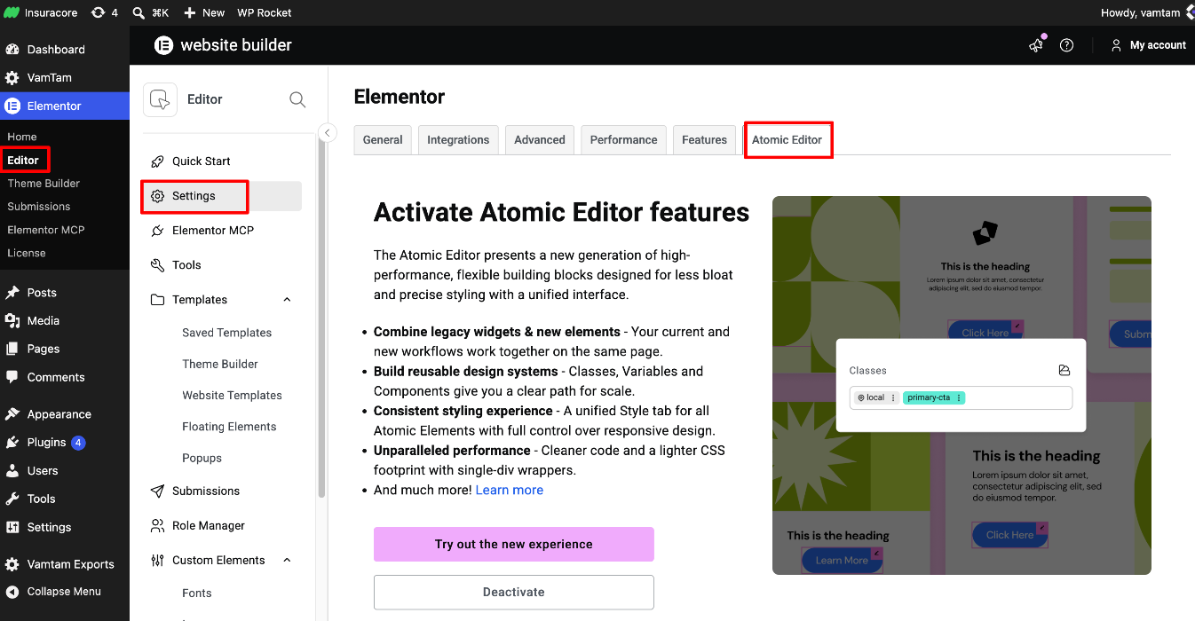
Elementor guide: Everything you need to know about version 4
2. Installation and updates
Installing and updating a V4 theme works the same way as with any VamTam theme:
- How to install the theme via the admin panel
- How to update a VamTam theme and the bundled plugins
- Where to find your purchase code
- Envato Elements clients - what you need to know
We recommend installing the theme on a fresh WordPress site.
3. Importing the demo content
After you activate the theme, follow the prompts to register it, install the required plugins and import the demo content. The import sets up pages, templates, menus and the theme’s design system, so your site starts out looking like the live demo.
If you’re installing on an existing site, read this first: Guidelines for safely importing demo content into an existing WordPress installation.
If something goes wrong: Import of sample demo data fails · How to re-import the demo content
4. The design system: Variables and Classes
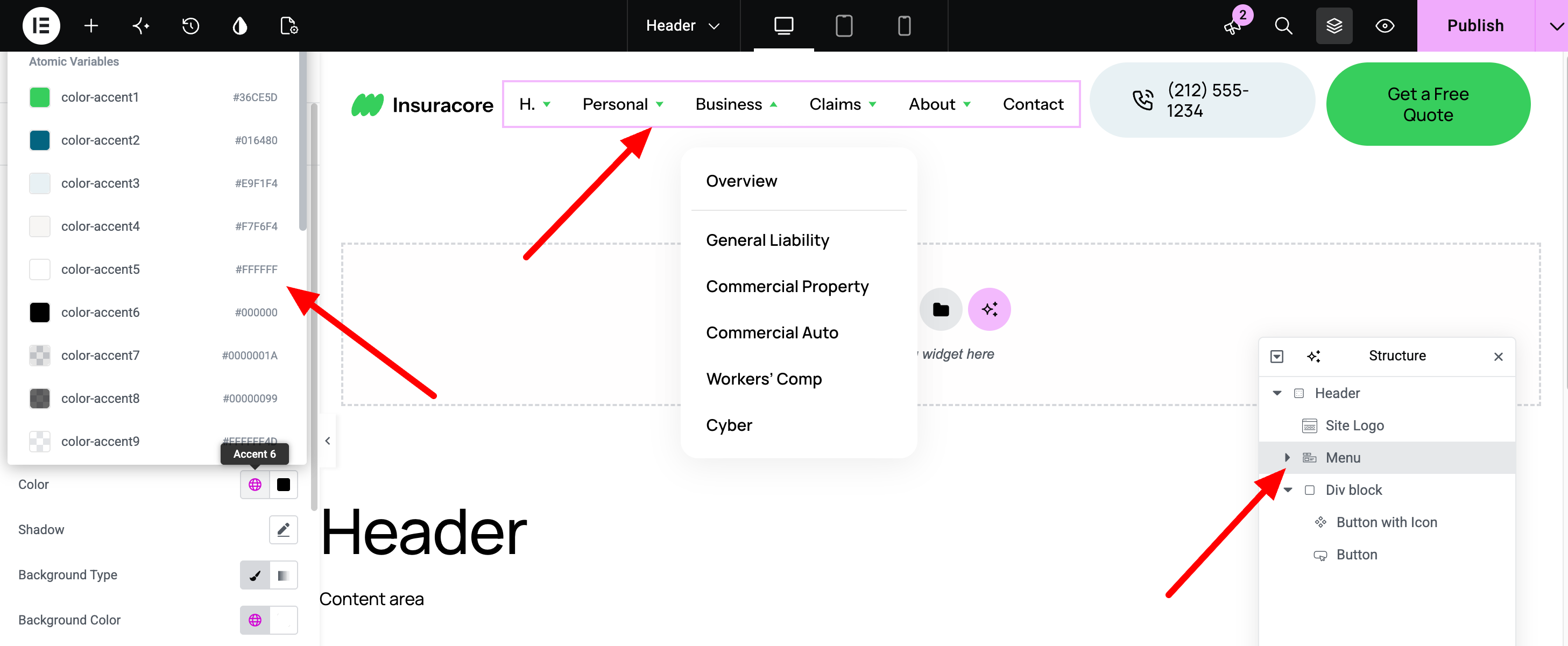
In V4 themes, the site-wide look comes from the design system rather than from Global Colors and Global Fonts. To open it, click the Design System icon in the editor’s top bar.
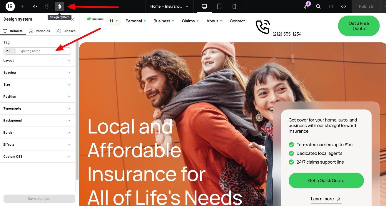
Variables are named values that the whole site uses. The theme includes:
- Color variables, such as color-accent1 to color-accent9
- A font variable for the main font, primary-font
- Size variables for spacing and corner radius, such as space-xs to space-xl and radius-s to radius-xl
When you change a Variable, every element that uses it updates across the site. For example, change color-accent1 and the brand green changes everywhere at once.
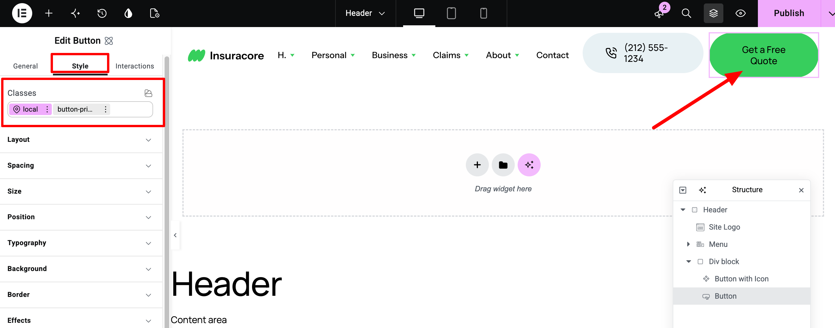
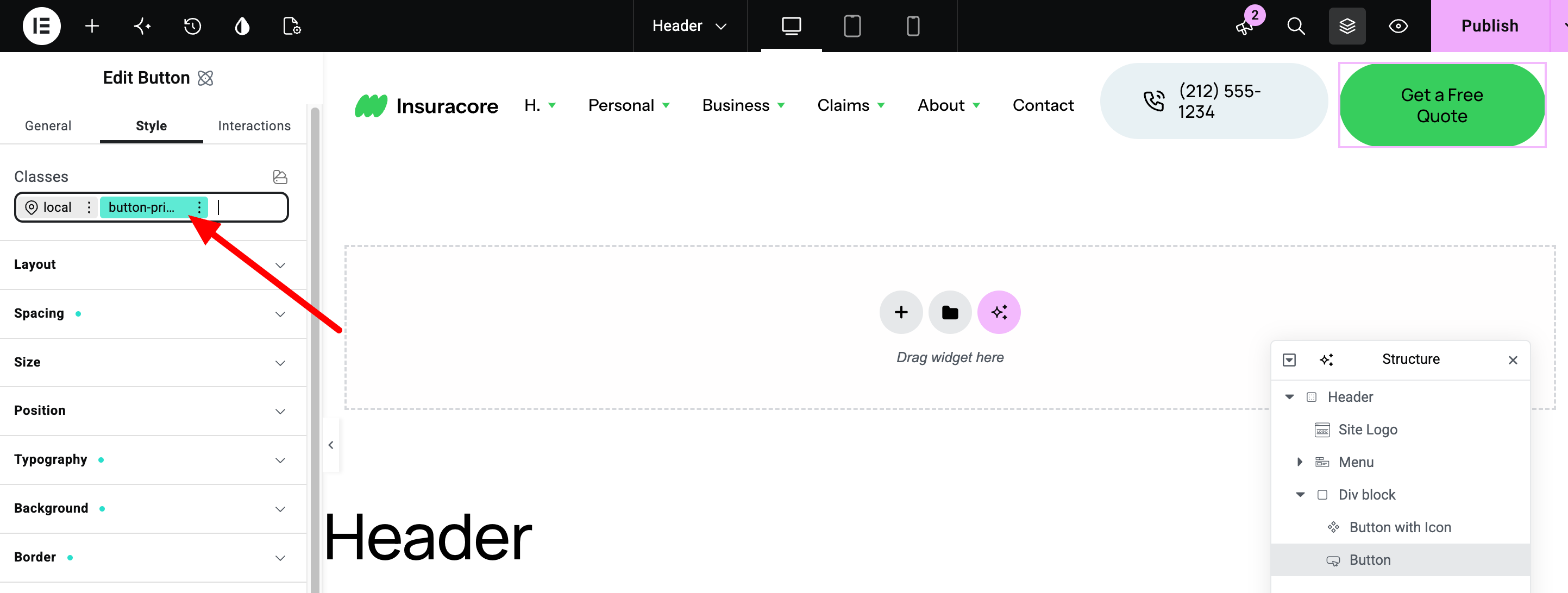
Classes are named sets of styles. Every element has its own local class, which applies to that element only. Many elements also share global classes, for example button-primary for all main buttons. In the Classes field, the class you’re currently editing is highlighted: pink for the local class, green for a global class. Select the local class to change only this element. Select a global class to change every element that uses it.
Classic widgets don’t use Variables directly. In InsuraCore, the color Variables are synced to Global Colors, so classic widgets such as the menus and social icons use the same colors. Keep the sync on when you change your brand colors.
Elementor guides: Variables Manager · How to sync variables and global elements · Classes in Elementor
5. Logo and site identity
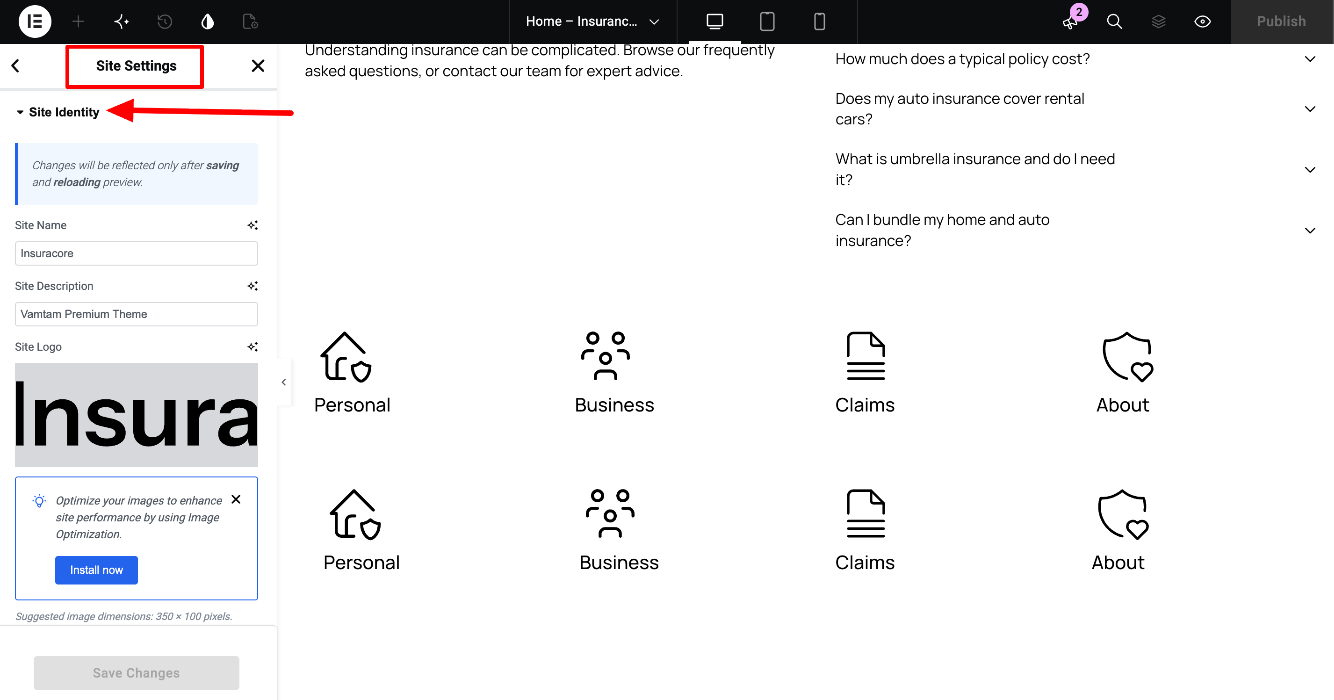
The site logo, name and favicon are set in Site Settings > Site Identity. Open Site Settings from the Elementor menu in the top-left corner of the editor.
Some areas use their own logo image, for example the light logo in the footer. Change those directly in their templates.
See How to edit the Header section for details.
6. Theme Builder
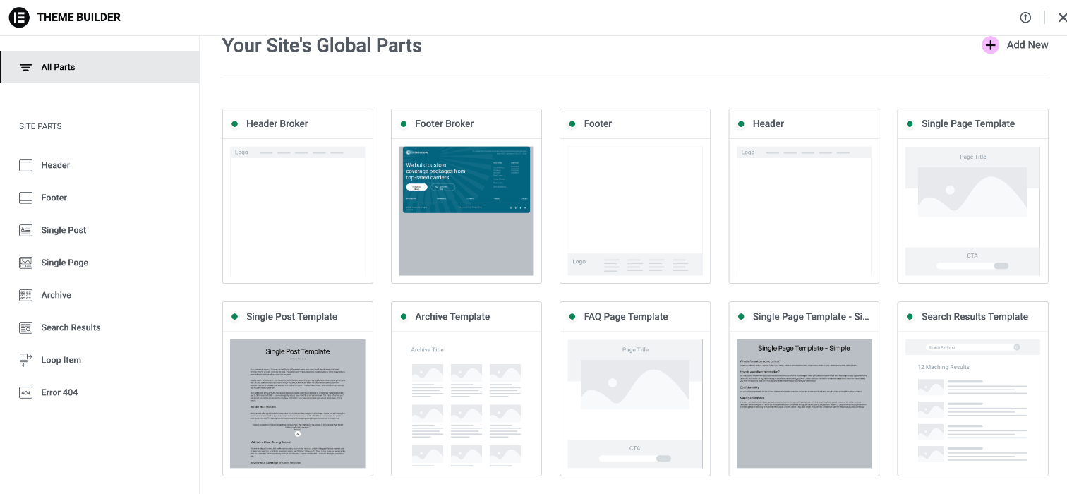
The theme’s site parts are Theme Builder templates. Open them from Templates > Theme Builder, or from the toolbar via Edit with Elementor. InsuraCore includes:
- Header and Footer (entire site), plus Header Broker and Footer Broker (Home - Insurance Broker page)
- Single Page Template, Single Page Template - Simple and FAQ Page Template
- Single Post Template, Archive Template and Search Results Template
- Error 404 Template
- Loop item templates for the blog and testimonials
- Popups, including the Search Popup and the quote form popups
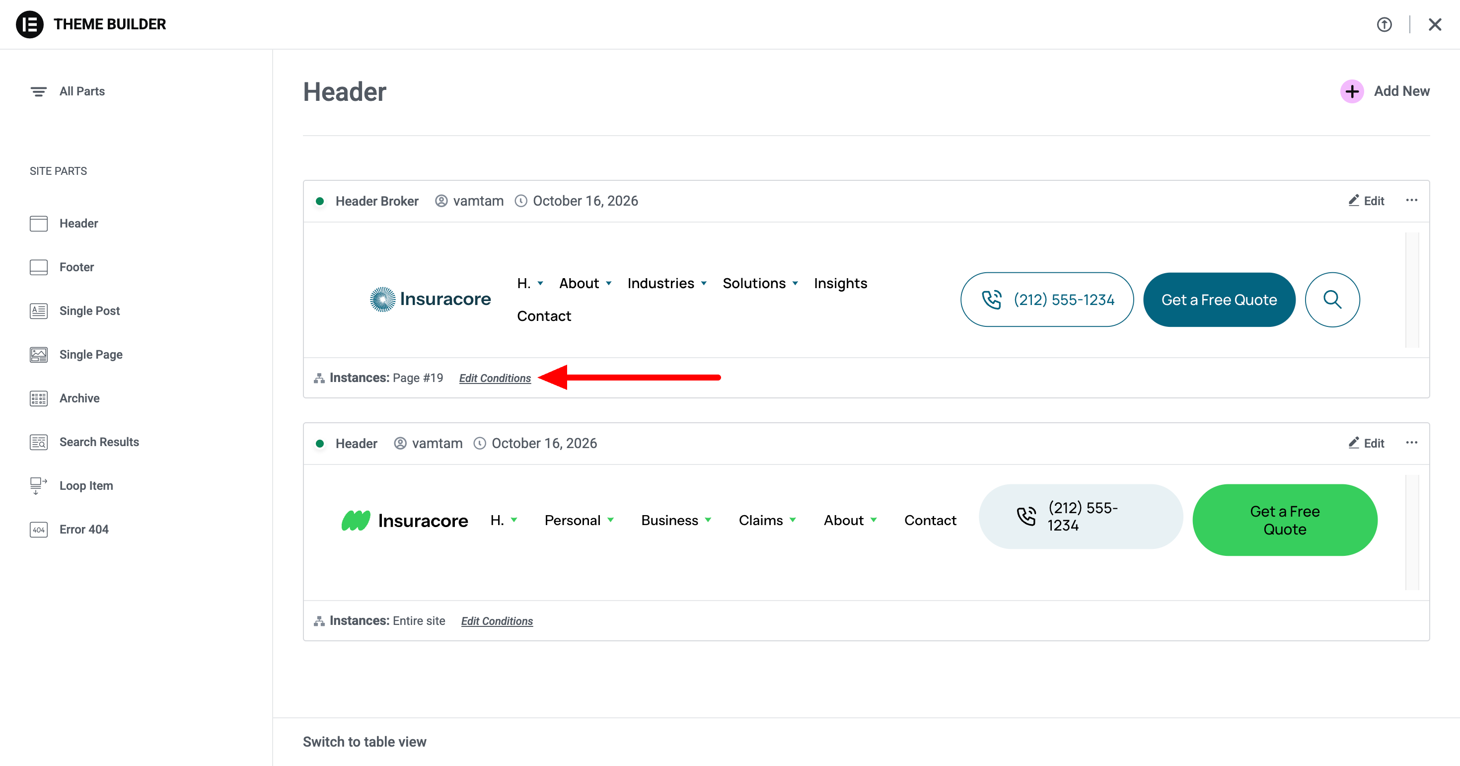
To change where a template appears, open it, click the arrow next to the Publish button and select Display Conditions.
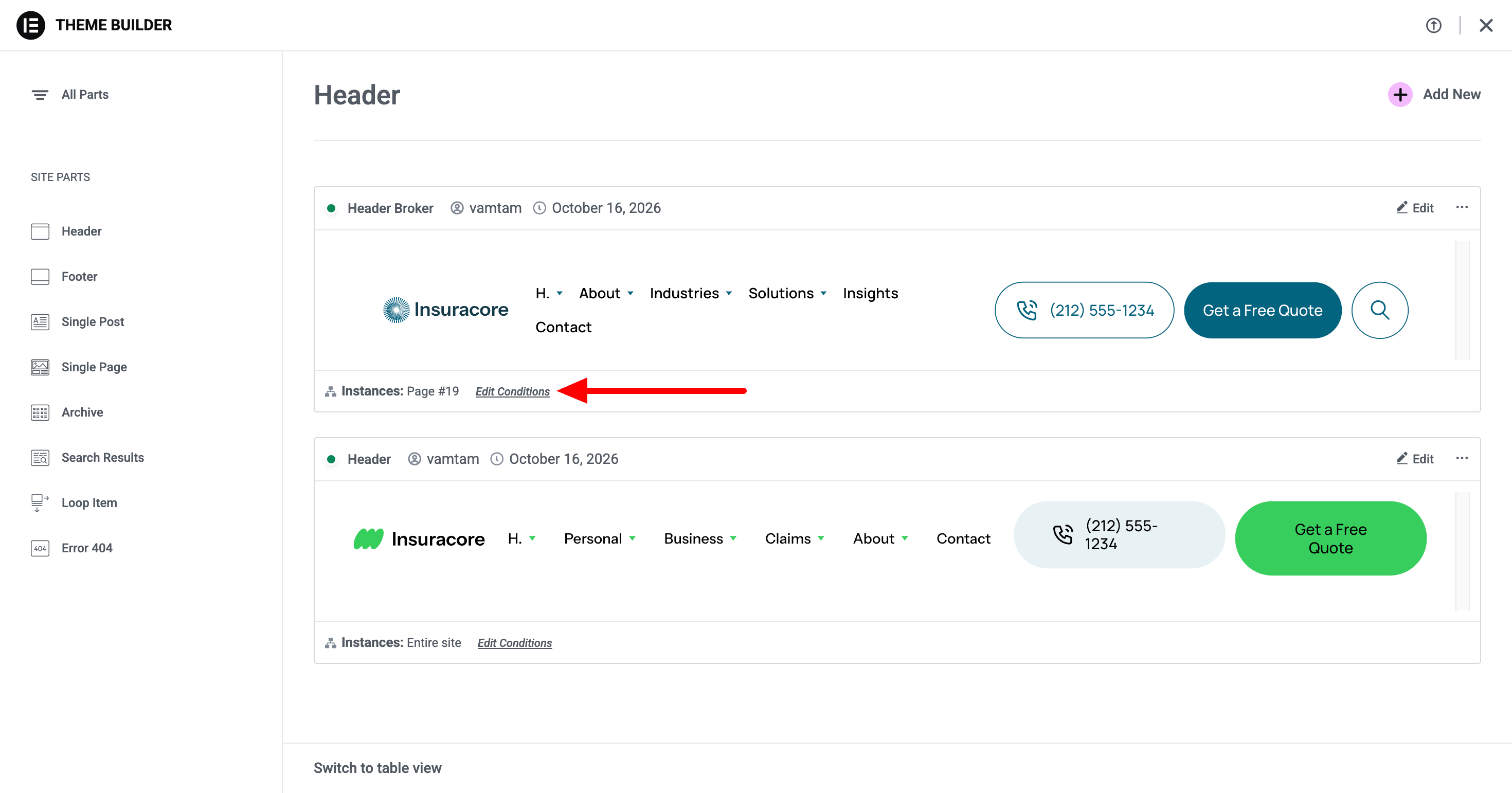
Elementor guides: What is the Theme Builder? · Set conditions for site part templates
7. V4 elements and classic widgets in the editor
You’ll see two types of elements in the editor:
- V4 (Atomic) elements, such as Flexbox, Div block, Heading, Paragraph, Button and Image. They appear in the Atomic Elements section at the top of the Elements panel. Their content is in the General tab, and their Style tab starts with the Classes field.
- Classic widgets, such as Site Logo, Menu, WordPress Menu and Social Icons. They have the familiar Content, Style and Advanced tabs.
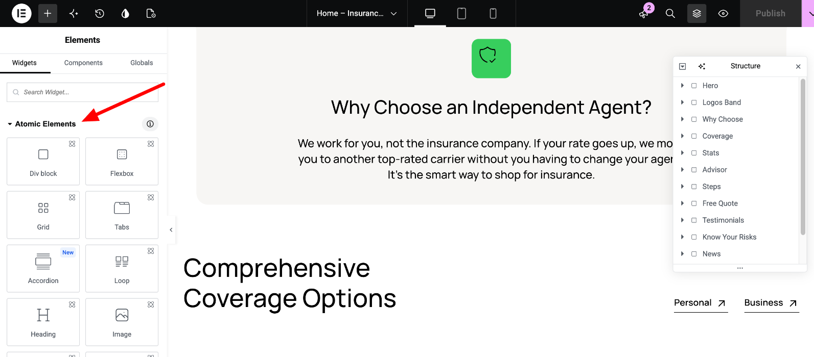
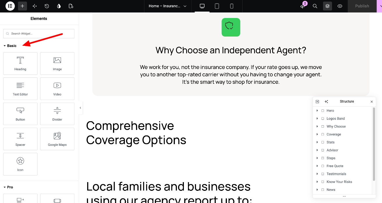
Useful tips:
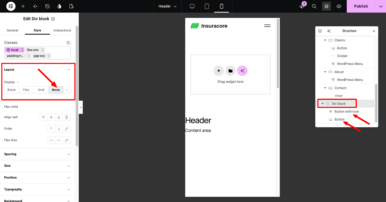
- Use the Structure panel (the layers icon in the top bar) to select elements, including elements that are hidden on the current device.
- To hide a V4 element on a device, switch to that device view, select the element and set Style > Layout > Display to None. Classic widgets still use Advanced > Responsive.
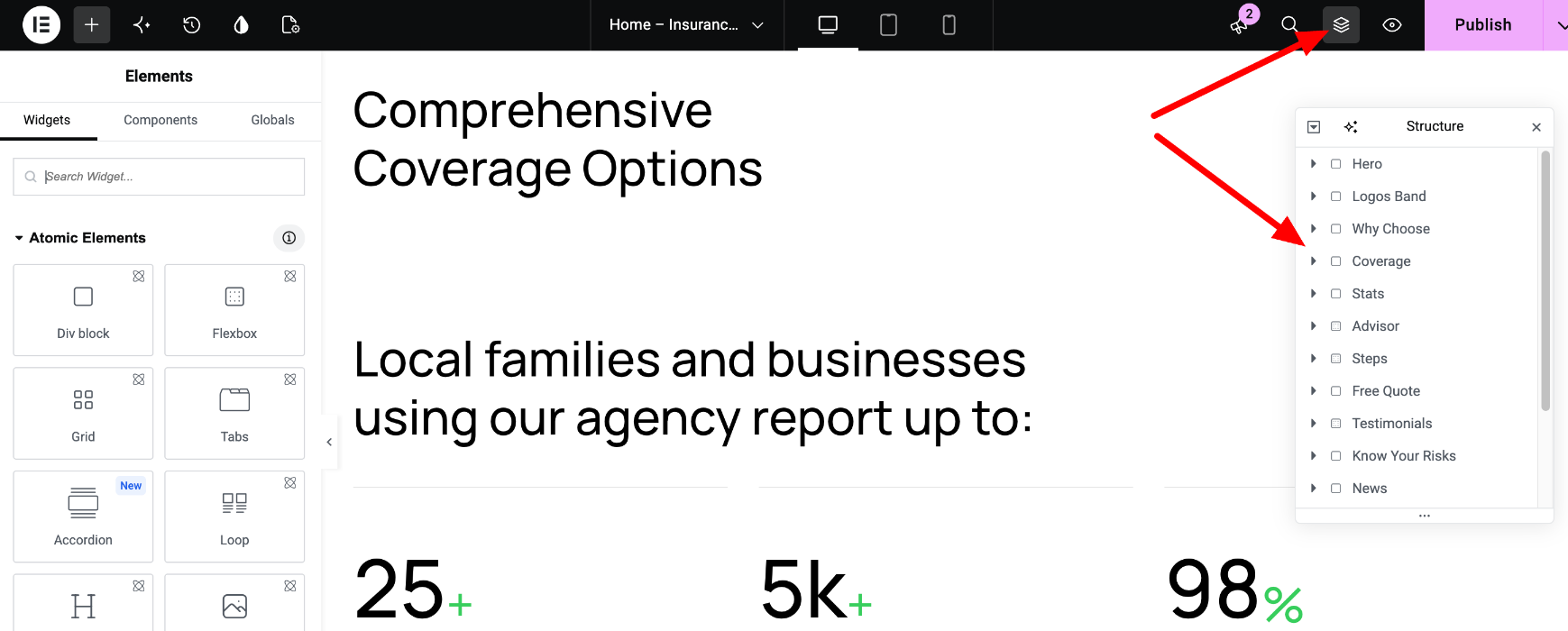
Elementor guides: Explore the V4 features · Responsive editing
8. Components
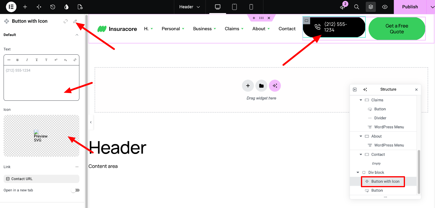
Components are reusable blocks, for example the phone button in the header. Every copy stays in sync with the original, and some fields can be changed per copy.
- To change a copy’s text, link or icon, select it and edit its fields. This changes that copy only.
- To change the component’s design, double-click it, or right-click it and select Edit Component. This changes every copy across the site.
Elementor guide: Components
9. FAQ
How do I set my homepage? See How to set a page as a homepage.
How do I edit the menus? See How to edit the Header section.
How do I edit the blog? Blog posts use the Single Post Template, the blog listing uses the Archive Template, and each post card is the Loop - Blog Post template. Edit them in Templates > Theme Builder.
How do I add custom CSS? See How to add custom CSS / PHP code. Before you add code, check whether a Variable or a Class can do the job, since changes there apply across the site.
10. Theme support
If you can’t find an answer here, see How to get theme support.