


Every VamTam Elementor V4 theme comes with a ready-made Design System: a set of Variables (colors, fonts and sizes) and Classes (reusable styles) that the whole demo is built with. When you change a variable or a class, the change shows up everywhere it is used, so you can adjust the look of the entire site from one place instead of editing each element.
This article explains how the Design System works in our V4 themes. The examples are from InsuraCore, but the same approach applies to every VamTam V4 theme.
If you haven’t installed your theme yet, start with the Setup Guide VamTam Elementor V4 Theme. To learn how to edit reusable sections, see Editing Components in VamTam Elementor V4 Themes.
1. What is the Design System?
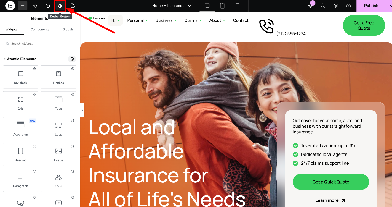
The Design System is the place where the theme’s Variables and Classes are stored. To open it:
- Open any page in the Elementor editor.
- Click the Design System icon in the top bar.
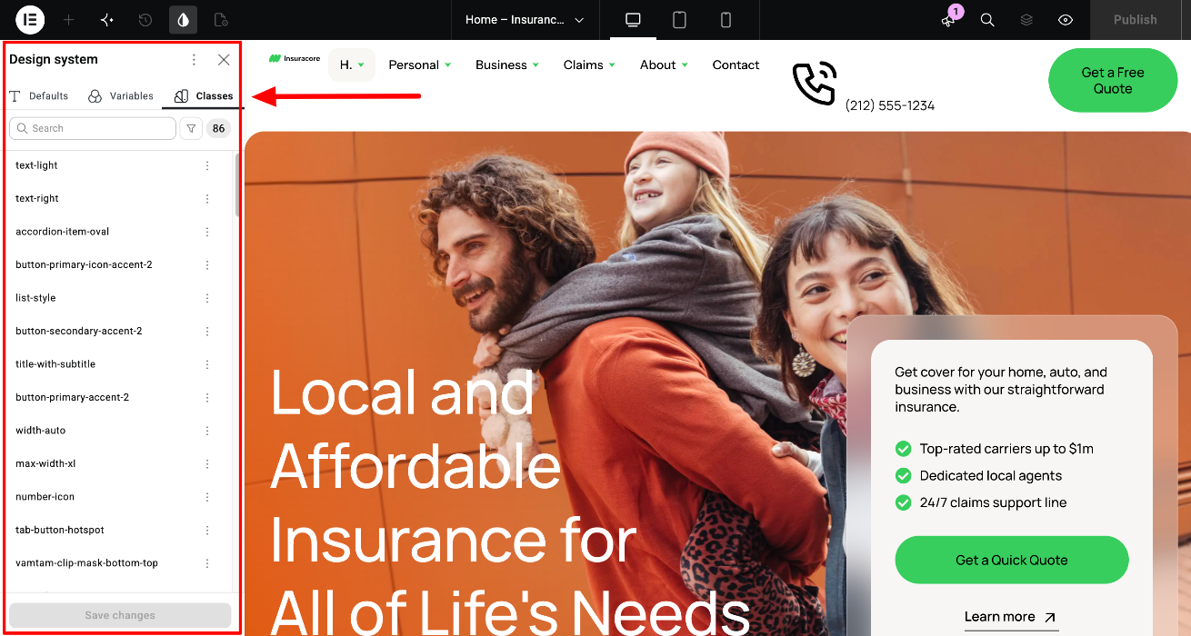
The panel has three tabs:
- Variables - the colors, fonts and sizes of the theme.
- Classes - the reusable styles applied to the elements, for example headings, buttons and spacing.
- Defaults - optional default styles for HTML tags such as H1-H6, paragraphs and buttons.
Elementor guide: Variables Manager
2. See Variables and Classes on the Style Guide page
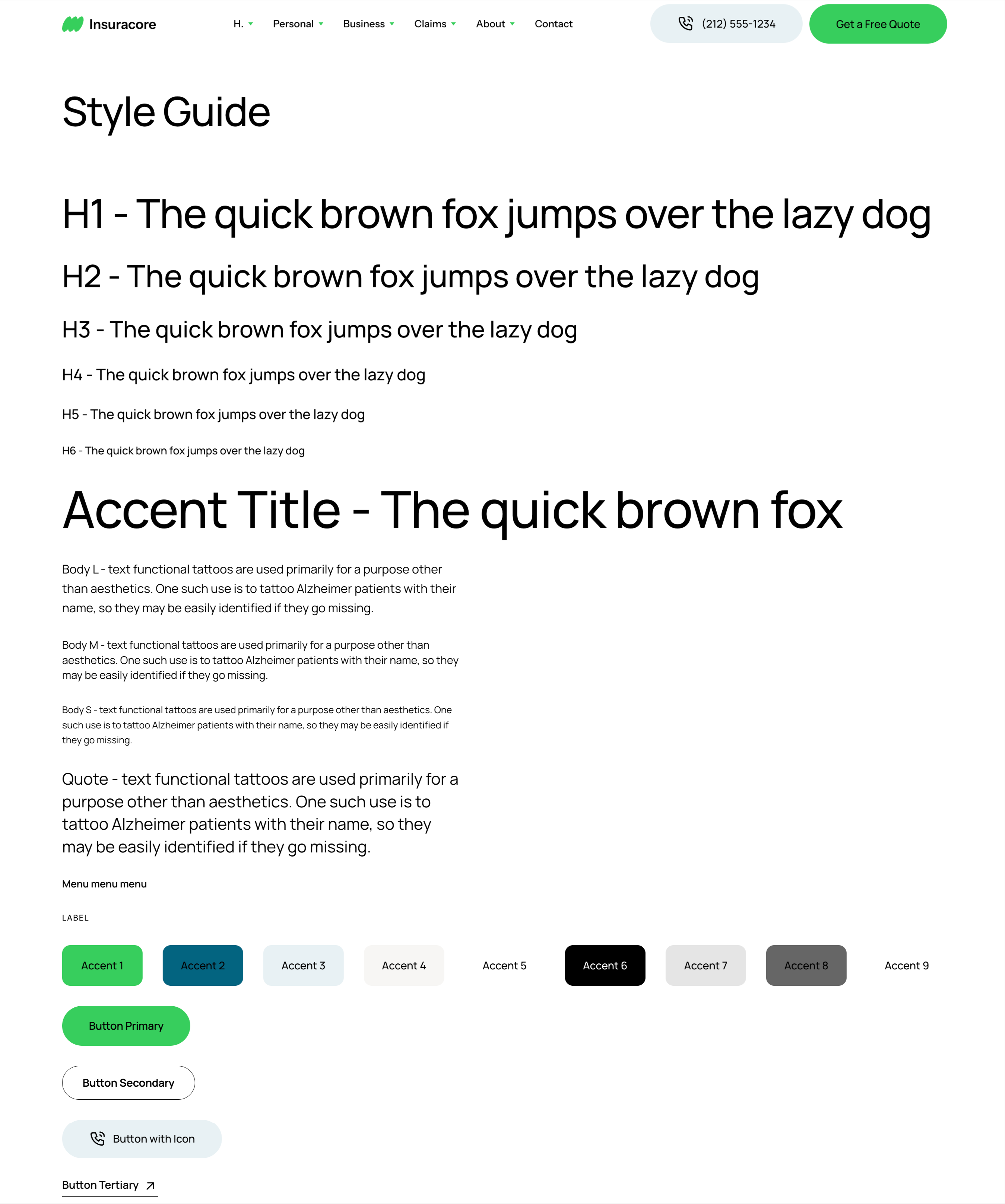
The demo content includes a page called Style Guide (/style-guide/). It shows the building blocks of the theme on one page:
- Headings H1-H6 and the paragraph styles
- The nine theme colors, Accent 1 to Accent 9
- The buttons
- The spacing scale, from Gap xxs to Gap xl
- All components of the theme
Use this page as your reference. Open it in the Elementor editor and select any element to see which variables and classes it uses. When you change a variable or a class, you can check the result for the whole theme on this page.
3. Change colors, fonts and sizes with Variables
A variable is a named value, such as a color, a font or a size. Elements use the variable instead of a fixed value, so when you change the variable, every element that uses it updates.
The variables in VamTam themes
In InsuraCore the variables are:
- Colors: color-accent1 to color-accent9, plus color-none (transparent).
- Font: primary-font (Manrope).
- Sizes:
- Corner radius: radius-0, radius-s, radius-m, radius-l, radius-xl
- Spacing: space-none, space-xxxs, space-xxs, space-xs, space-s, space-m, space-l, space-xl
- Section spacing: section-padding-default, section-space-y
- Borders: border-width
Some size variables are fluid. For example, space-m and section-space-y adjust automatically between mobile and desktop, so you don’t have to set separate values for each device.

Change a variable
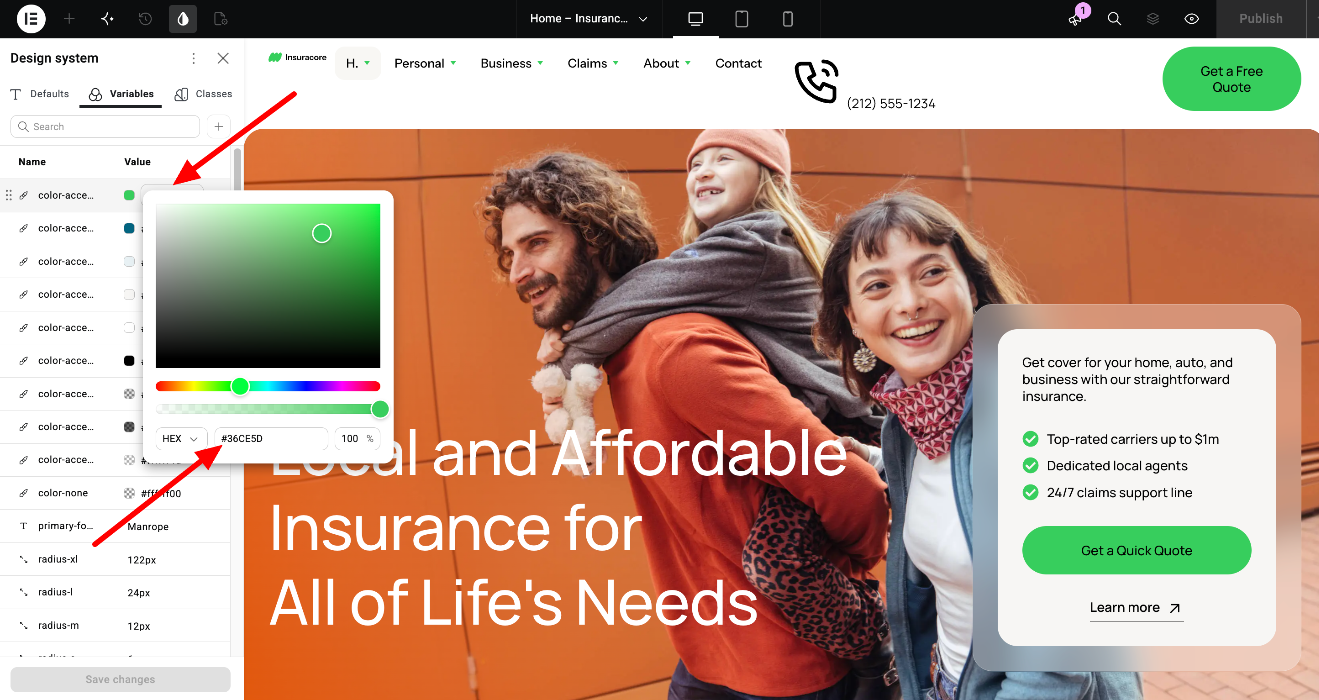
- Open the Design System panel and go to the Variables tab.
- Double-click the variable you want to change, for example color-accent1.
- Enter the new value.
- Click Save Changes.
The new value is applied to every element that uses the variable. Open the Style Guide page to check the result.
Elementor guide: Variables Manager
Use a variable on an element
- Select the element.
- Go to the Style tab and open the setting you want to change, for example Background.
- Click the variable icon next to the field.
- Select a variable from the list.
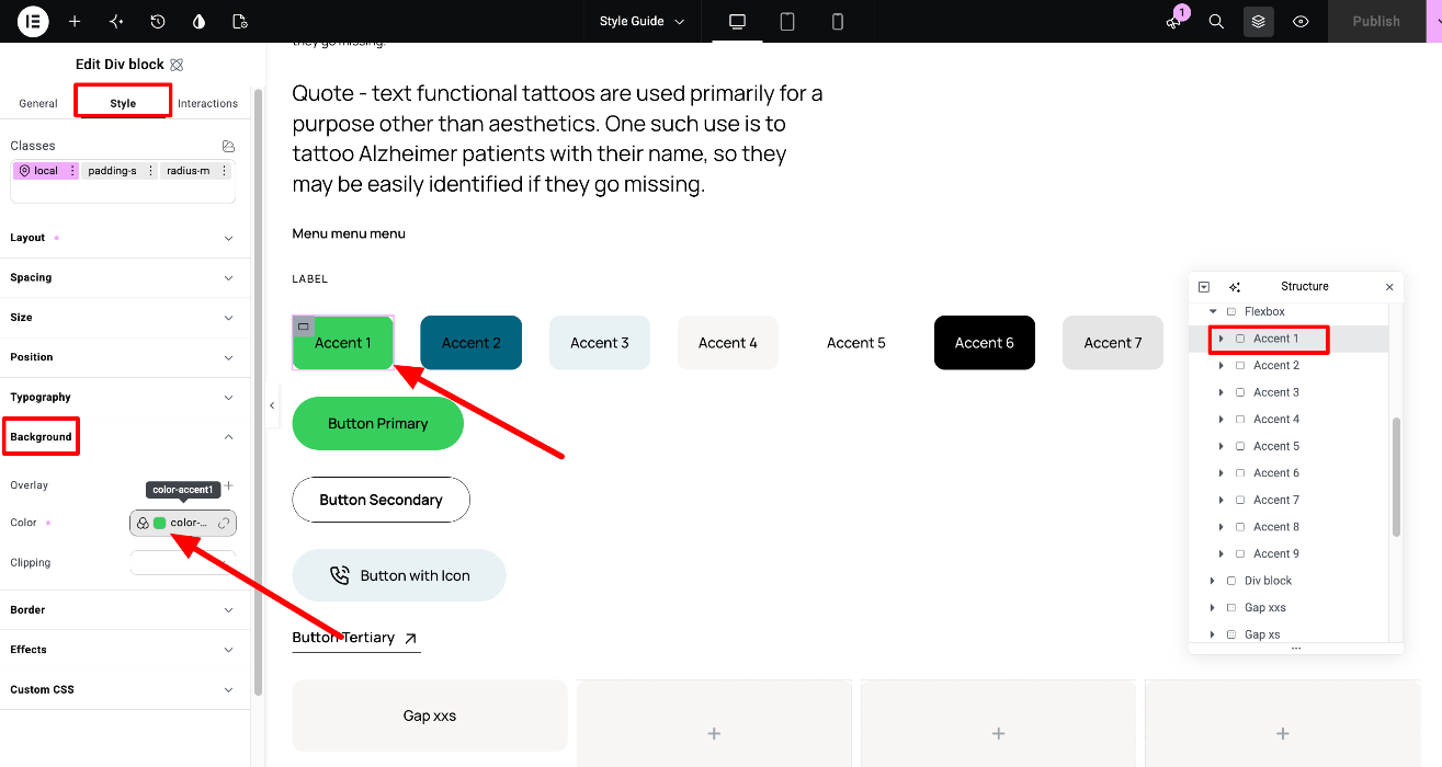
Elementor guide: Variables
Sync variables with the classic widgets
A few parts of our V4 themes still use classic Elementor widgets, for example Site Logo and Menu. Classic widgets use Global Colors and Global Fonts instead of variables. To keep both in sync, the color variables in InsuraCore are already synced to Global Colors, so when you change a color variable, the classic widgets update too.
The font variable primary-font is not synced. If you change it, also change the font in Global Fonts (Site Settings), so the classic widgets use the same font.
To sync a color variable:
- Open the Design System panel and go to the Variables tab.
- Click the three dots next to the variable.
- Select Sync to Global Colors.
- Click Save Changes.
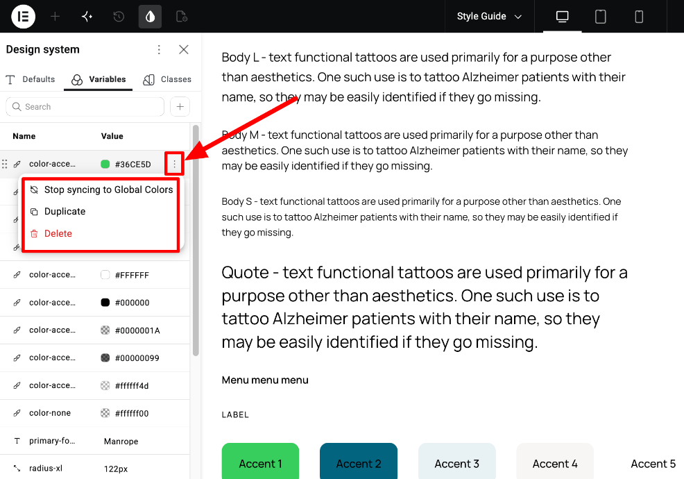
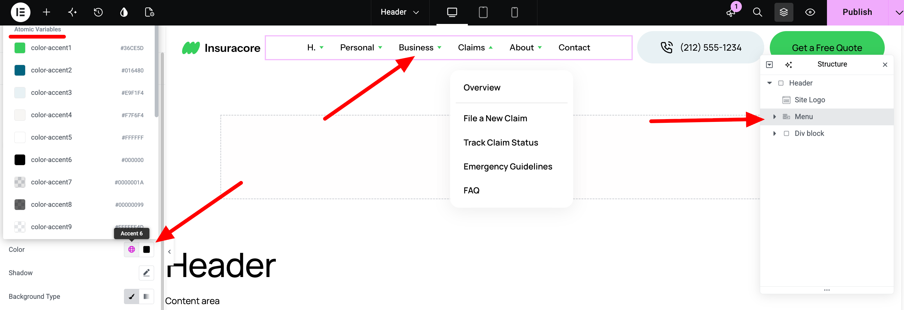
Elementor guide: How to sync variables and global elements
4. Style elements with Classes
A class is a saved set of styles, for example the font, size and color of a heading. When you apply a class to an element, the element gets all of its styles. When you edit the class, every element with that class changes.
Global and local classes
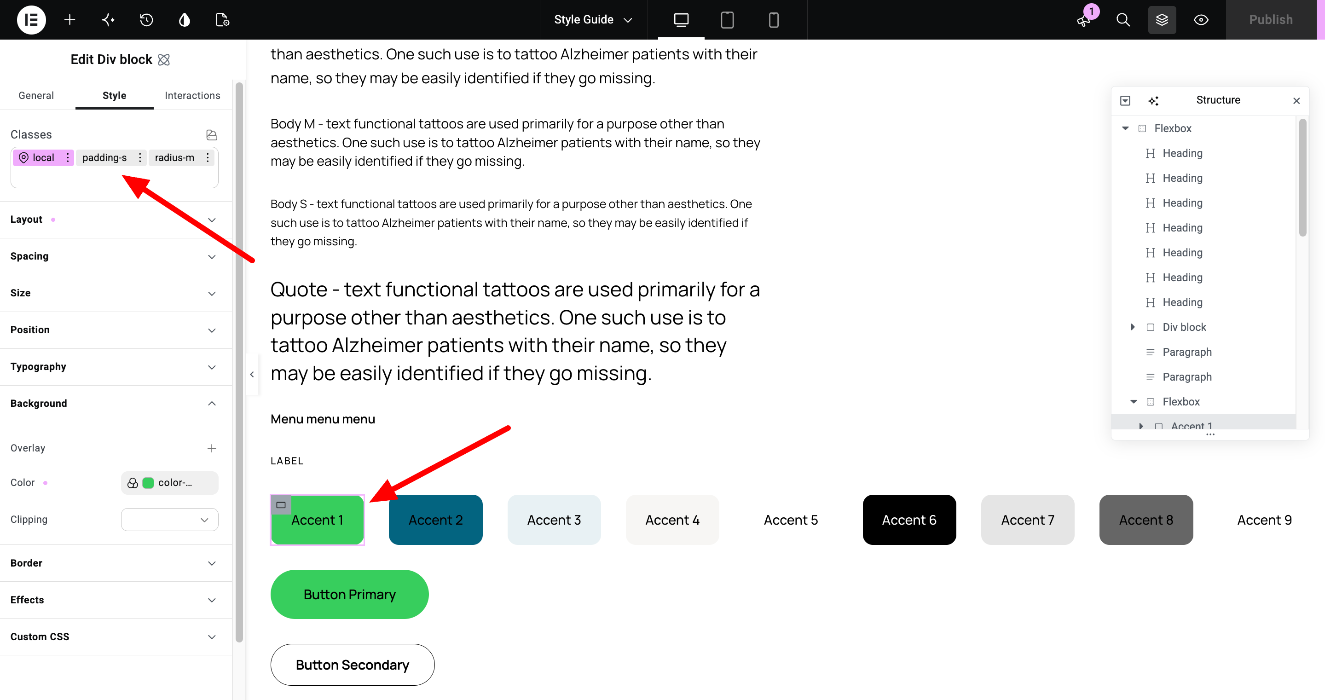
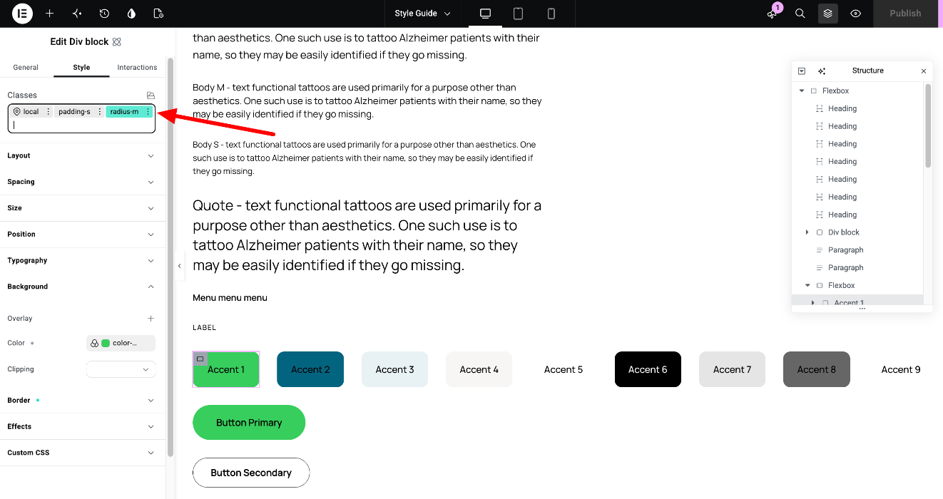
Every element has two kinds of classes, listed in the Classes field at the top of the Style tab:
- Local class - belongs only to this element. Changes to it affect only this element.
- Global classes - shared by many elements. Changes to them affect every element that uses them.
The class you are currently editing is highlighted: pink if it is the local class, green if it is a global class. The other classes are grey. Select the local class to change only this element, or the global class to change all elements that use it.
For example, the Accent 1 block on the Style Guide page has a local class with its background color and two global classes: radius-m (rounded corners) and padding-s (inner spacing).
Tip: When you hide an element on a specific device (device view > Style > Layout > Display: None), do it on the local class. If you do it on a global class, every element with that class is hidden.
The classes in VamTam themes
In InsuraCore the main classes are:
- Typography: heading-1 to heading-6, body-l, body-m, body-s, label, accent-title
- Buttons: button-primary, button-secondary, button-tertiary
- Layout: flex-row, flex-column, flex-row-mobile, flex-center, max-width-xxs to max-width-xl, section-sides-padding
- Spacing: padding-none to padding-xl, gap-none to gap-xl
- Corners: radius-none, radius-s, radius-m, radius-l, radius-xl
- Backgrounds: background-light, background-dark
The class names describe what they do, so you can combine them. For example, the flexbox rows on the Style Guide page use flex-row together with a gap class such as gap-xxs.
Apply or remove a class
To apply a class:
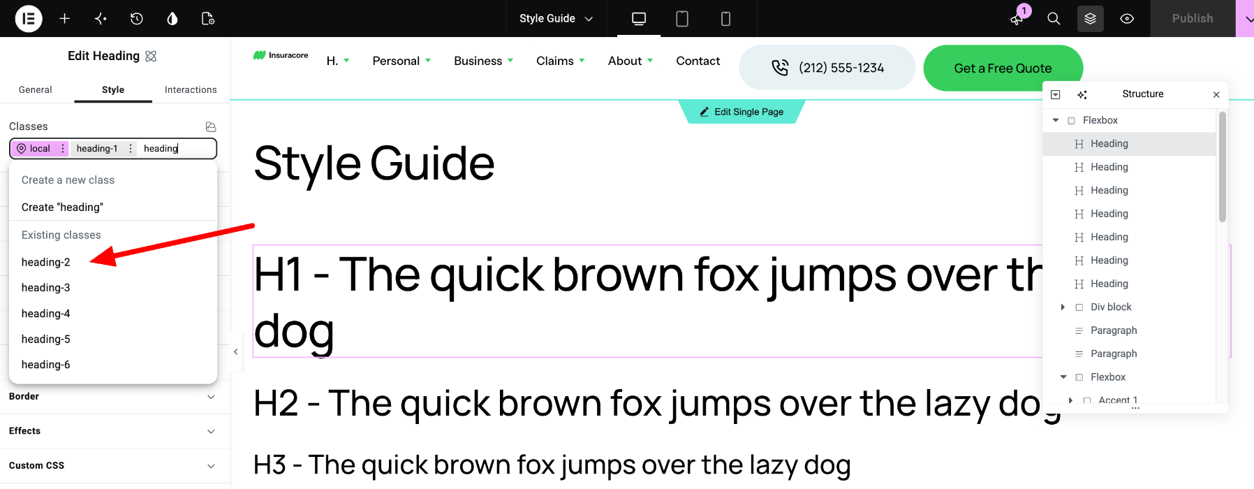
- Select the element and go to the Style tab.
- Click the Classes field.
- Select the class from the list, or start typing its name.
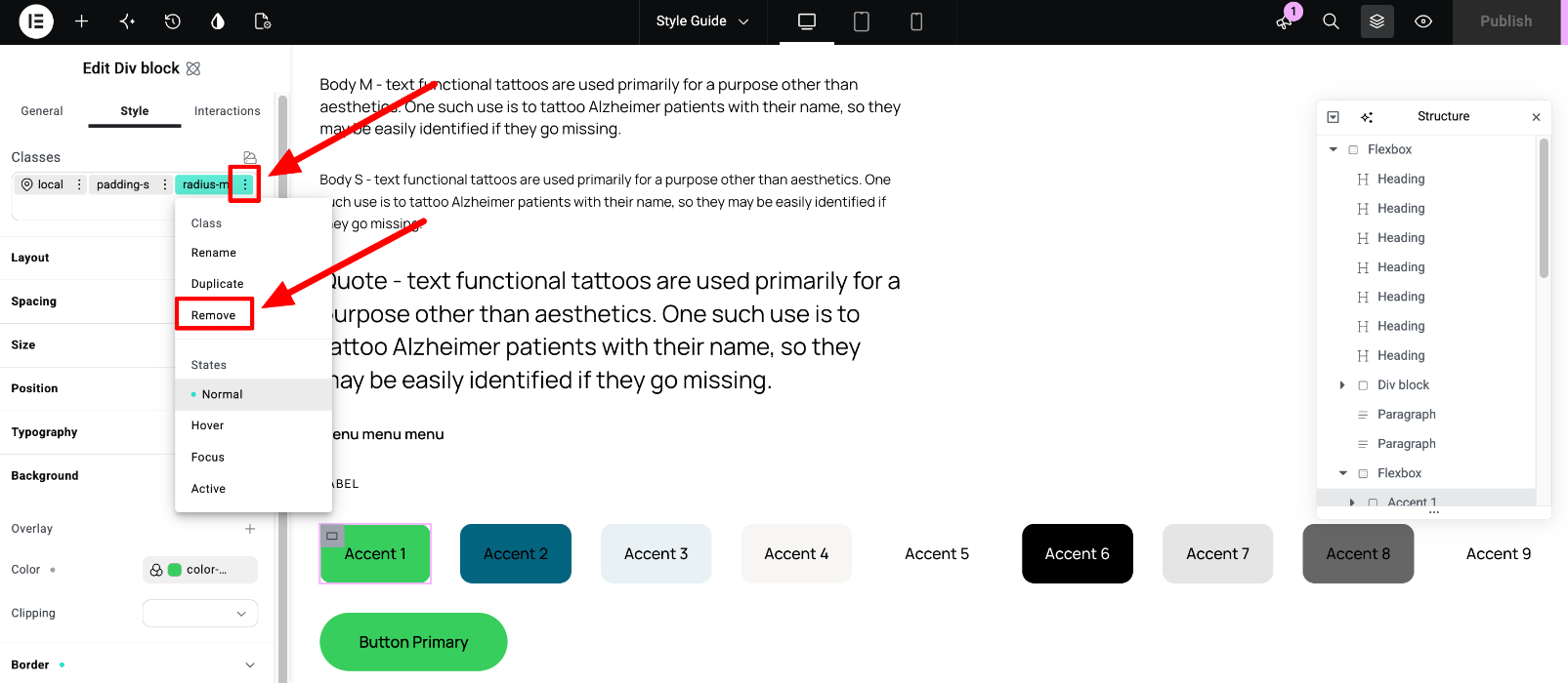
To remove a class from an element, click the three dots next to the class name and select Remove. This only removes the class from the element. The class stays on the site.
Elementor guide: Classes in Elementor
Edit a global class
Only administrators can change global classes. Other roles can apply them, but can’t edit them.
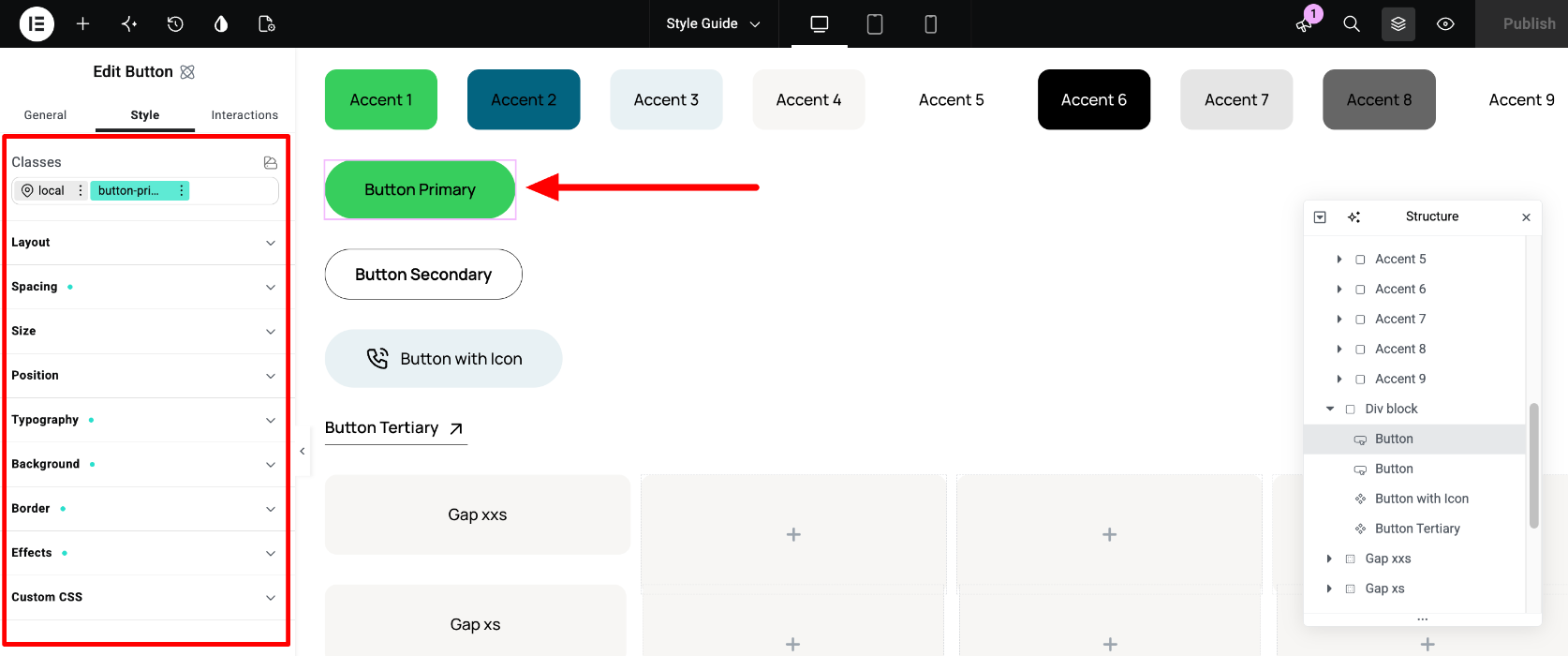
- Select an element that uses the class, for example the Button Primary button on the Style Guide page.
- In the Classes field, click the global class, for example button-primary. It turns green.
- Change the styles.
- Click Publish.
Every button with the button-primary class on the site now uses the new styles.
Elementor guide: Classes in Elementor, User roles and classes
Manage classes
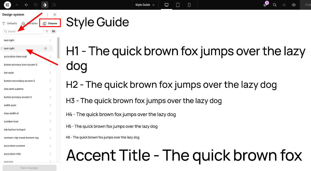
Open the Design System panel and go to the Classes tab. There you can:
- Search for a class by name.
- Find where a class is used - hover over the class and click the target icon.
- Rename a class - the new name applies to every element that uses it.
- Reorder classes by dragging them. When two classes set the same property, the class higher in the list wins.
- Delete a class - this changes the styling of every element that uses it, so we don’t recommend deleting the theme’s classes.
The local class always has the highest priority, so a style you set on the local class overrides the global classes.
Elementor guide: The Elementor Editor Class Manager, Prioritize conflicting styles
5. What about Defaults?
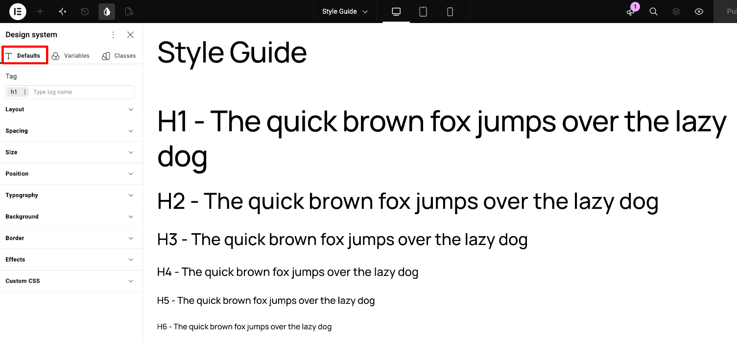
The Defaults tab lets you set site-wide styles for HTML tags, for example all H2 headings or all paragraphs. This is one option Elementor offers. In our themes we use classes instead (only administrators can change them), so the Defaults tab is empty.
When you add a new element, apply a class to it, for example heading-2 to a heading or body-m to a paragraph, to match the rest of the theme. Classes override defaults, so if you do set defaults, the classes will still take priority on the theme’s elements.
Elementor guide: How to Define Default Styles for Atomic Elements in Elementor
6. Export and import the Design System
You can save all variables and classes to a ZIP file and import them into another Elementor site, for example to move your adjusted design from a staging site to your live site.
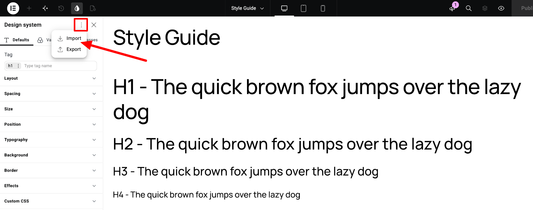
- Click the Design System icon in the top bar.
- Click the three dots in the Design System panel.
- Select Export. A ZIP file with your variables and classes downloads to your computer.
To import, open the same menu on the other site and select Import. If a variable or class with the same name already exists, you can choose to override it or keep the existing value.
Elementor guide: How to import and export design systems